
The first podcast of the new year. Nick and I count down our Top 7 favorite games of 2017. Why Top 7? Because there were only two of us and that got us as close to 15 games that we’d normally do with 3 people doing a Top 5.
The big news is at the end of the episode we announced that we are moving away from a biweekly format to a monthly one. The fact of the matter is that this podcast is essentially a hobby and it was taking up a lot of time for most of us. Chris stepped back a few months back to spend time with his family and Nick wants to be able to do things other than play games and editing podcasts. And I… I technically don’t even work for PopMatters anymore, so eh.
I do love talking about games I love, but the real fun I had with this episode was creating the image for the post. A couple of years ago we used to have these custom images like the one above of different games we discussed on the podcast. Then one year that stopped. I don’t know what happened, but since I had to create my own for the look back at 2007 post I figured I could create one for 2017.
The first choice I had to make was how big each slice was going to be in terms of pixels. PopMatters doesn’t use a set size, but all the images we checked were around 1200×900. Then it was a matter if I would go with 5 sliced images of 250 pixels each or 6 of 200 pixels. The first one I cut was Night in the Woods at both pixels sizes and determined 200 was good enough, even if I cut off Gregg’s face. Getting that extra game in felt more important. We each get three entries instead of one person getting 3 and the other getting 2.

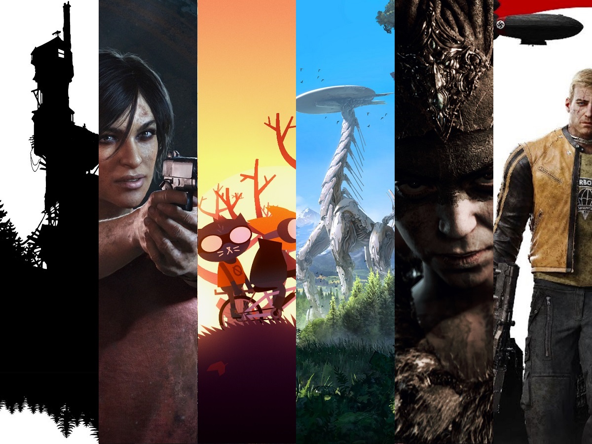
This was my first attempt. I tried to choose iconic or possibly promotional shots, something that you could identify the game immediately from. However, once I finished putting it together it hurt my eyes to look at. It was so orange. 5 out of 6 had it and 4 of them were saturated in the color.
I tried balancing it out with images, or at least slices of images, that were bluer. It helped a little, but it still hurt my eyes. That Torment: Tides of Numenera image isn’t that great in slice form. It’s a vista of a strange city and you don’t really get that. I also felt there were too many faces pointed front.

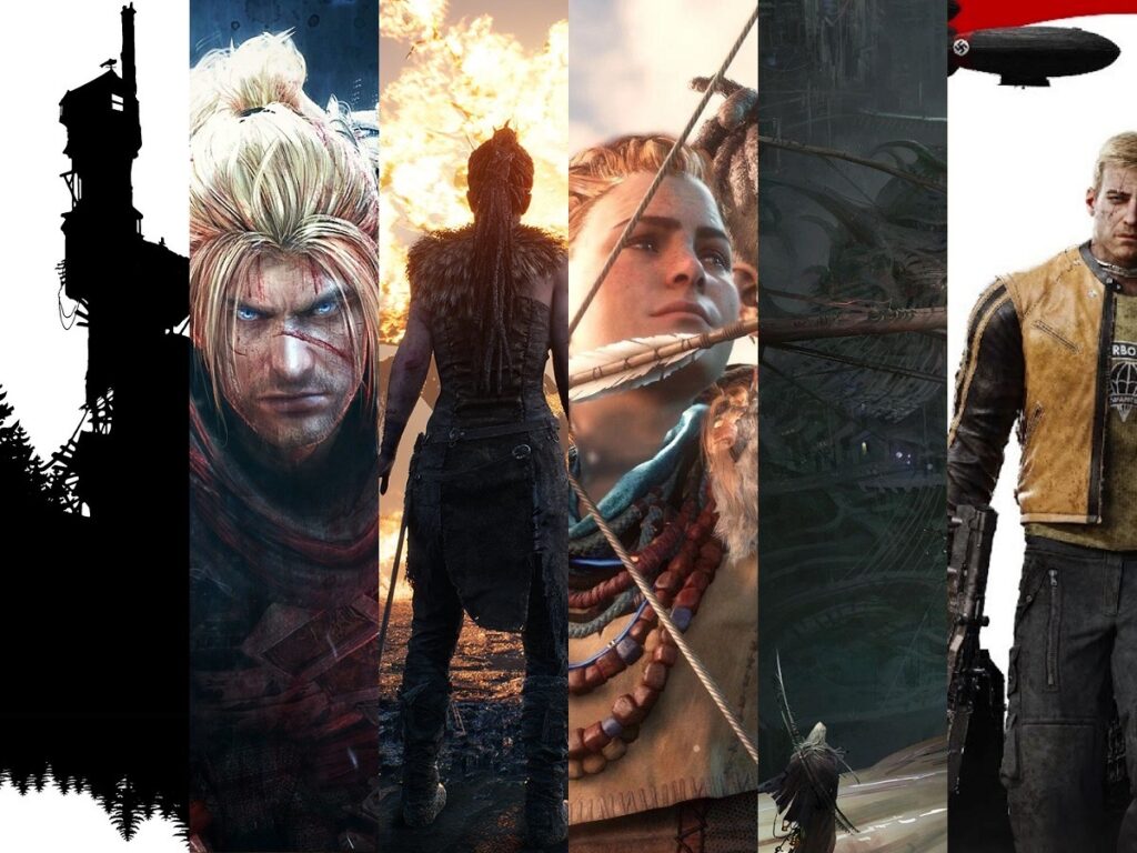
This was better. The Nioh promotional image was uninspired. Chloe, at least, looks a bit more dynamic in her pose and I’ll admit a sense of ‘fuck you’ politics in trying to cram as many women into the image as possible. Though that got a little messed up when I realized that the Horizon: Zero Dawn image was the wrong one. It was fine, but with Chloe it would have been two faces at 3/4 pose in the same direction next to one another. The orange was still getting to me. I found a new image. This one gets some bright blue and lush green to vary up the dull color pallet and the robot dinosaur is vertical which works for the slice format. Unfortunately, this was still hurting my eyes. I finally identified the source as the fire in the Hellblade image. It was too bright and also not that great either. The screenshot and scene that image is from is spellbinding and iconic, but not so much if you can’t see the whole thing.

Which brings us to the final image. The shadowy close up on Senua was a much better choice for the format it was going into. What Remains of Edith Finch and Wolfenstein II stayed where they were through the whole process. I nailed them on the first attempt. The white on the edges were a good balance and psudeo bookends.
You can fin the podcast over at PopMatters, SoundCloud, iTunes and through the RSS feed.
“The hardest battles are fought in the mind.”